Attorney Websites: 3 Seconds to Make Your Case
By Michael Shapiro |
92% of online adults now use search engines to find information on the web. And almost 60% of adults use the web to find information on local businesses.
It’s probably no surprise to hear that people looking for an attorney today begin their search online. In addition to the statistics above, studies show that 75% of all consumers now go online to research a business, and 53% state that they specifically use a business’s website as their primary source of information. As a young attorney in search of clients, your website is your most important marketing tool.
Today your website is your first impression, and it better be a good one. When you shake someone’s hand, you can watch their eyes, judge their reaction and adjust your presentation accordingly. Not so in the online world. According to Google, you have three seconds or less to make a positive impression or your site visitor will leave. One study says it’s as little as .5 seconds. Half a second to convince them that you are the attorney they should trust… or they’re gone, clicking on the sites of your competition.
I hope that this article shows that, while extremely important, writing a successful website is an achievable goal for young attorneys.
The guiding principles for drafting a website
In a recent article, the ABA Tech Division gave attorneys a list of things to consider when creating a website. Their list included:
- Think about your audience – primary (people you want as clients), secondary (not necessarily prospective clients but important nonetheless), and “Unintended” (be careful what you put on your site because you never know who will stop by)
- Keep it brief – remember that three-second window you have
- Make it timeless – don’t lock yourself into a website you have to constantly maintain
- Make it dynamic – where you do want to spend time is on a blog with constantly updated content, with social links (that are also active), consider paid-content to ensure quality and cut down on your time commitment.
- If you keep these goals in mind while writing the content for your website, you are sure to create an effective marketing tool.
What goes into an effective, professional website?
Of course, it’s easy to say you need a good website – again, not exactly groundbreaking information — but how do you know if you have a good website? How do you know if your site will compel clients to call, or drive them away? Sometimes the difference is simpler than you’d ever imagine.
When asked what they want to see when they visit a website, 44% of local consumers say they are looking for Product, Price, Place, and Phone — “the four Ps.” It would be easy to think that that doesn’t apply to your site, and you’re right, it’s not an exact fit for attorneys—for instance, attorney websites do not generally provide pricing information. But the core message of what site visitors want to see immediately upon clicking through to your website still holds.
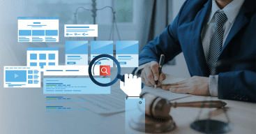
At hibu, we create up to 40,000 websites a year – about 5% of those sites are for attorneys. We’ve developed the hibu Website Anatomy (see image on page ___), a simple breakdown of what any website needs to have, how a site needs to be written and designed. Your site needs to be created in a way that puts the information your visitors want most where it practically jumps off the screen. Your site needs to immediately show:
- Who you are
- Where you are
- What you do
- How to get in touch with you.
Of course, there’s more you need to communicate in those three seconds than who, what, where and how. Perhaps, as an attorney, it’s more precise to say that your site needs to instantly communicate “the four Cs” — Confidence, Capability, Clientele, and Contact. Prospects coming to your website need to feel that:
- They can trust you
- That you are professional
- That you have experience in their type of case
- How they can reach you (now).
As an attorney, the trust factor is more important for your site than for almost any other profession. Your site can’t look DIY. It can’t feel cookie-cutter. It needs to reflect the same proficiency and experience that you would communicate in a live meeting.
Think about the impression you want someone to get when they visit your office – that’s the same impression your website needs to project when someone visits your site… and remember, it all has to happen in three seconds or less.
The bottom line – building trust
A 2011 study showed that 70% of those surveyed “don’t trust a badly designed website.” As simple as it sounds, if your website doesn’t look good, you don’t look dependable. It used to be that as long as you could be found online, prospects would see you as a credible firm. Those days are gone. Like everything else today, clients are shopping for you online and you better look good and sound credible. You have three seconds. Go.
Sources:
The Pew Internet & American Life Project, a long-term study on U.S. Internet usage “Yodle Insights: What Consumers Want From Local Businesses,” June 24, 2015
DAC Group and Kantar, “Consumer Search Behavior Study,” Feb 5, 2014
Brightlocal.com, Feb. 2014, What-local-consumers-want-most-from-local-business-websites
OnePoll survey, on behalf of BaseKit, 2011
Americanbar.org/groups/departments_offices/legal_technology_resources/resources/charts_fyis/websitefyi.html